

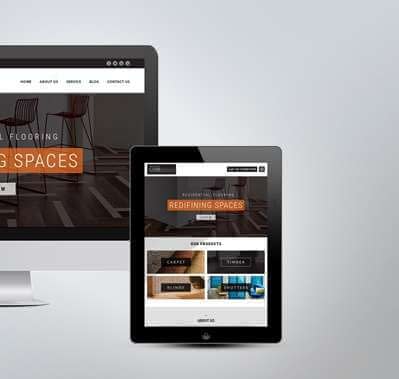
Usually customers who access the business could potentially connect with the company on the go through their smartphones.
Last year, apps from retail businesses took up to 27 percent of consumer’s time which shows how critical it is to reach out to customers when they are active online. At the same time, 67 percent of consumers say they are more likely to purchase from a mobile friendly website than they are from a website.

|
The Pros for Responsive Websites |
The Pros for Mobile Apps |
|
A single website, single URl |
Accessibility & Speed |
|
Easy SEO |
Visibility on the physical device |
|
Low Cost to create |
Can include phone features, camera etc |
|
Easy to update content |
Once download, it’s available offline |
|
No approval process |
Available in the app store |
|
All functions are available |
.82% increase in mobile conversion rates post responsive site launch
Timeline: 8 weeks World Famous theme park: The theme park needed to create a mobile optimized version of their ticket purchase flow, which was currently delivering an un-optimized desktop experience. After a short timeline of responsifying their existing site, the Merkle team also addressed server side optimization to increase site performance.
1. 82% increase in mobile conversion rates post responsive site launch
2. Decrease 30-50% of page weight from existing web content
3. “This is one of the smoothest projects we’ve ever had with a vendor to date, we’ve been really impressed.” – Senior eCommerce Manager
ResponsiveJS increased smartphone checkout conversion by 54% Timeline: Less than 14 weeks
Customers wanted a better checkout process from mobile devices, but NARS wanted to avoid maintaining a mobile site. They wanted to provide an intuitive mobile experience without sacrificing the striking imagery that, as a cosmetic company, is paramount to their brand. We collaborated with their team to deliver a solution that worked for their users, kept the bold imagery, and still loaded quickly.
1. ResponsiveJS increased smartphone checkout conversions by 54%.
2. Increased tablet checkout conversions by 24%.
Case Studies for Responsive Websites
Company: Time
Responsive design is well known for delivering benefits to SEO, social, and user experience. But the question remains: will a responsive design deliver the performance you need?
These 4 case studies from ecommerce, publishing, and education show huge improvements in revenue and key traffic metrics. It’s proof that when done right, responsive design not only provides a better user experience, but delivers results.
Time.com went responsive in 2012. They wanted a better user experience on mobile, but more importantly, to move to a more efficient publishing operation. According to GM Craig Ettinger,
“With Responsive we could create a design with a single code base and that experience would then be available across all devices, but we also wanted to make sure that when we launch new things on the site, new sections or design existing sections, we could more efficiently make that a cross-device optimized experience.
Company: Skinny Tie
1. 42% revenue growth on all devices
2. 13.6% conversion rate increase
3. 377.6% revenue growth on iPhone
4. 71.9% conversion rate increase on iPhone
5. 44.6% increase in time spent
6. 23.3% decrease in bounce rate
Skinny Ties is another responsive commerce success story. The numbers speak for themselves, but Brendan Falkowski at their agency Gravity Department describes their experience:
“Balancing performance, quality, and maintainability was a high priority. We continually evaluated techniques for deferring, contextually loading, and scaling assets before finding a compromise within Magento’s constraints and our content goals. An uncached, initial page load is 210 KB (63% smaller than the former site).”